Branding& Identity Design
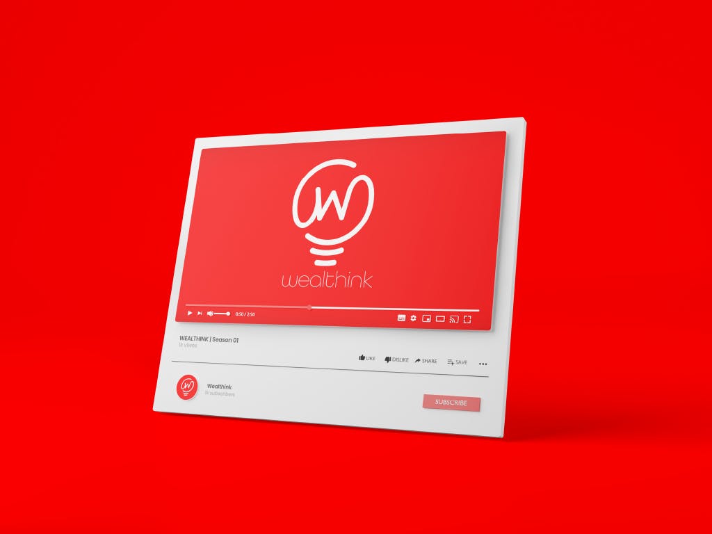
Wealthink YT channel
Context
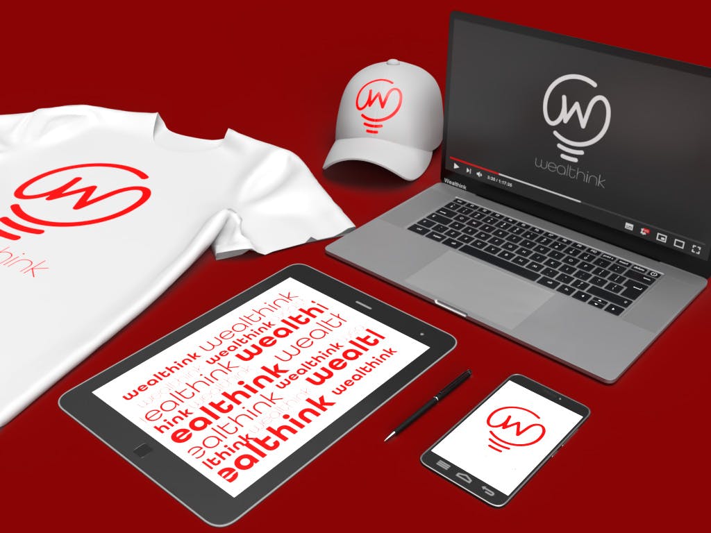
In venturing into the realm of financial literacy, the logo serves as a beacon of knowledge, illuminating the path for the curious minds. The bold red color not only captures attention but also ignites a sense of urgency and importance surrounding financial awareness. Through meticulously crafted mockups, the branding's adaptability is showcased, ensuring a consistent message across various platforms, thereby building a cohesive and recognizable brand identity in the financial education landscape.
Solution
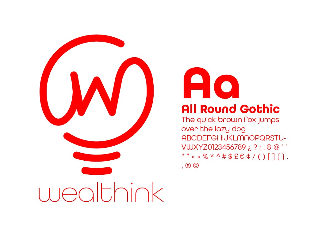
My decision to blend a light bulb with the letter 'w' in the logo was driven by the desire to symbolize enlightening viewers with financial acumen. Employing a vivid red hue for both the letter and the light bulb, this design commands attention and engages the eye. Besides the logo, I have curated a range of mockups to illustrate the versatile application of the branding across diverse mediums.
The journey of conceiving this logo was anchored in the mission of enlightening the audience with essential financial knowledge. The fusion of a light bulb with the letter 'w' is a visual metaphor for illumination and wisdom, crafting a narrative that transcends the graphical representation.

The chosen vibrant red color is not arbitrary; it's a powerful hue known for drawing attention and evoking a sense of urgency and excitement, aligning with the imperative nature of financial literacy.
Moreover, the creation of various mockups was a strategic step towards showcasing the versatility and applicability of the brand identity across different mediums. This exercise was about more than just visual appeal; it was about ensuring a seamless and coherent brand communication irrespective of the platform.
Each mockup was designed to reflect the brand's core message of enlightening financial insight, ensuring that the logo remains a strong, recognizable emblem across all touchpoints.

The holistic approach towards the logo design and the subsequent mockup creation was geared towards building a brand identity that resonates with the target audience, making financial education appear not just essential but engaging.
The vibrancy and the symbolism encapsulated within the logo aim at creating a lasting impression, ensuring that the brand stands out in a crowded financial education space. Through this design endeavor, a visual identity has been crafted that not only catches the eye but also encapsulates the brand's mission of shedding light on the often daunting realm of financial knowledge.