Branding& Identity Design
Time for Pets
Context
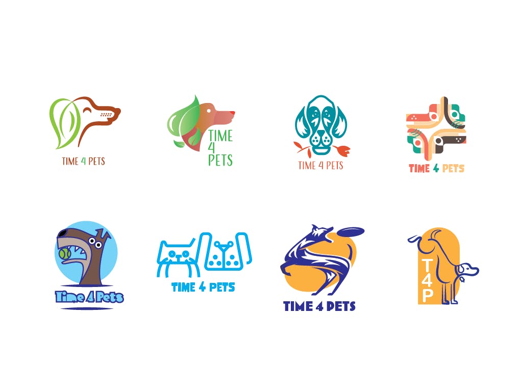
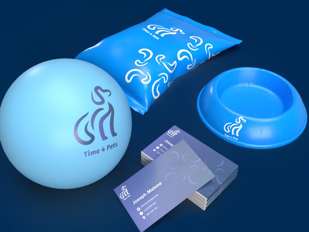
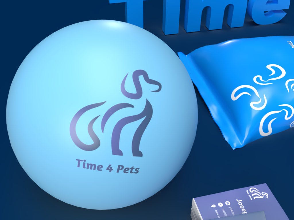
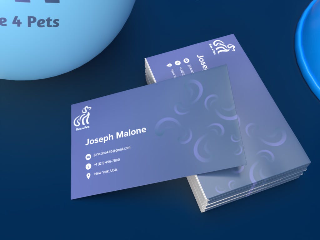
The elegance of line art encapsulated in the dog graphic symbolizes a blend of simplicity and sophistication, portraying a brand that values both modernity and professionalism. The navy blue color further accentuates these qualities, exuding a calm, trustworthy aura. Through various mockups, the logo's versatility and adaptability are displayed, ensuring the brand's visual identity remains consistent yet dynamic across different platforms, building a strong, recognizable brand persona in a competitive market.
Solution
My choice gravitated towards integrating a sleek and minimalist dog graphic adorned with exquisite line art, executed with a keen eye for detail. The selected navy blue hue emanates a sense of professionalism and sophistication, aligning seamlessly with the anticipations of the target audience. To add a personalized touch and depth to the project, I fashioned a range of mockups to exhibit the logo design across various applications.
The thought process behind the design was to capture the essence of sophistication while maintaining a modern minimalist aesthetic. The dog graphic, crafted meticulously with beautiful line art, is not just a visual element but a symbol of loyalty, trust, and companionship. The choice of navy blue as the color scheme emanates a sense of professionalism, reliability, and sophistication, which is aimed at resonating with the target audience's expectations.
The execution of line art with a keen eye for detail signifies a high level of craftsmanship and a modern, clean approach to design. This design strategy aims to appeal to an audience that appreciates a blend of traditional values encapsulated in a contemporary visual narrative.
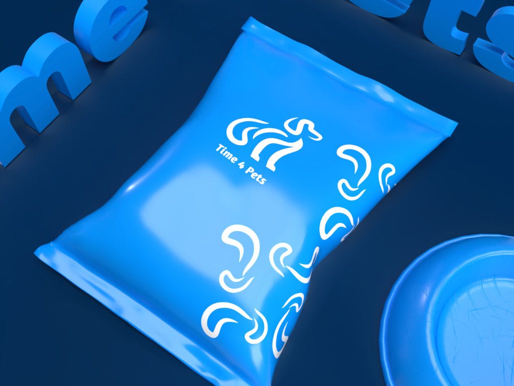
Additionally, the creation of various mockups was a strategic initiative to showcase the multifaceted application of the logo design. It provided a glimpse into how the logo would interact with different mediums, ensuring its adaptability and consistency in conveying the brand's message. Each mockup was designed to reflect the brand's ethos, creating a coherent visual identity that would remain recognizable and resonate across various touchpoints.
The holistic approach taken in this project—from the minimalist yet expressive graphic to the sophisticated color palette and the meticulously crafted mockups—was about building a brand identity that not only appeals visually but also aligns with the core values and expectations of the target audience. This endeavor was more than just a design project; it was about creating a visual narrative that communicates the brand's message effectively, building a foundation for a strong and enduring brand presence in the market.