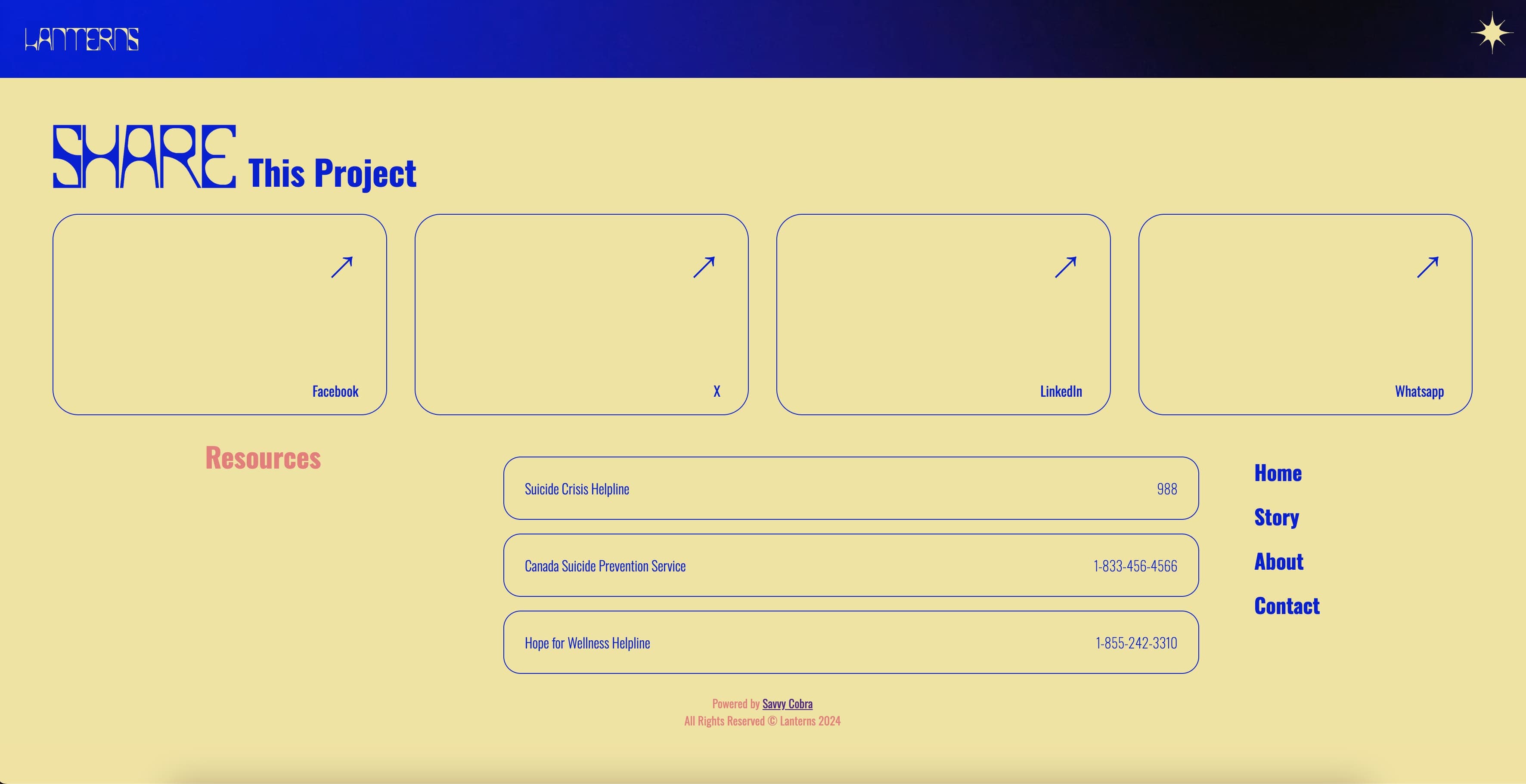
WebDesign & Development
Lanterns
Visit WebsiteContext
Lanterns is a visionary project aimed at supporting individuals dealing with mental health challenges by sharing success stories that illuminate the path to resilience and recovery. This initiative is particularly targeted towards a younger audience, reflecting the higher incidence of mental health issues within this demographic. The design and functionality of the site are crafted to resonate with young users, offering them a source of inspiration and community.
Solution
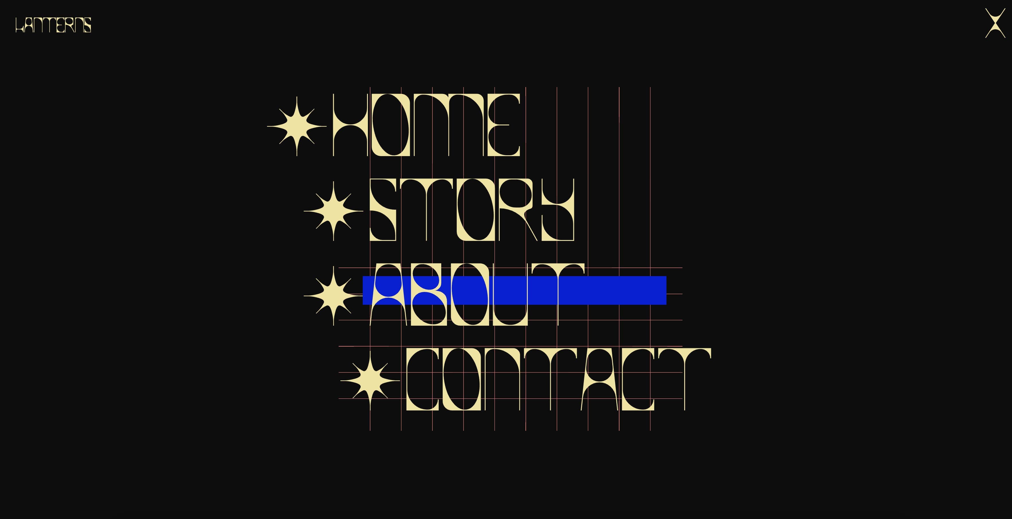
The design of Lanterns combines dynamic colors, bespoke animations, and a custom font by Savvy Cobra named 'Lanterns' to create an environment that is both engaging and soothing. This unique font shines against dark backgrounds, reminiscent of light piercing through darkness, symbolizing hope. The interactive elements, such as flashing grid squares on images, represent the fragmentation of identity often felt by those experiencing mental health conditions, making the site not only a resource but also a reflection of their experiences.

Color Scheme and Visual Themes: The Lanterns platform utilizes a thoughtful color palette that plays on the contrasts between light and darkness, symbolizing the journey from despair to hope. This choice supports the underlying message of the platform and appeals directly to users seeking solace and inspiration.
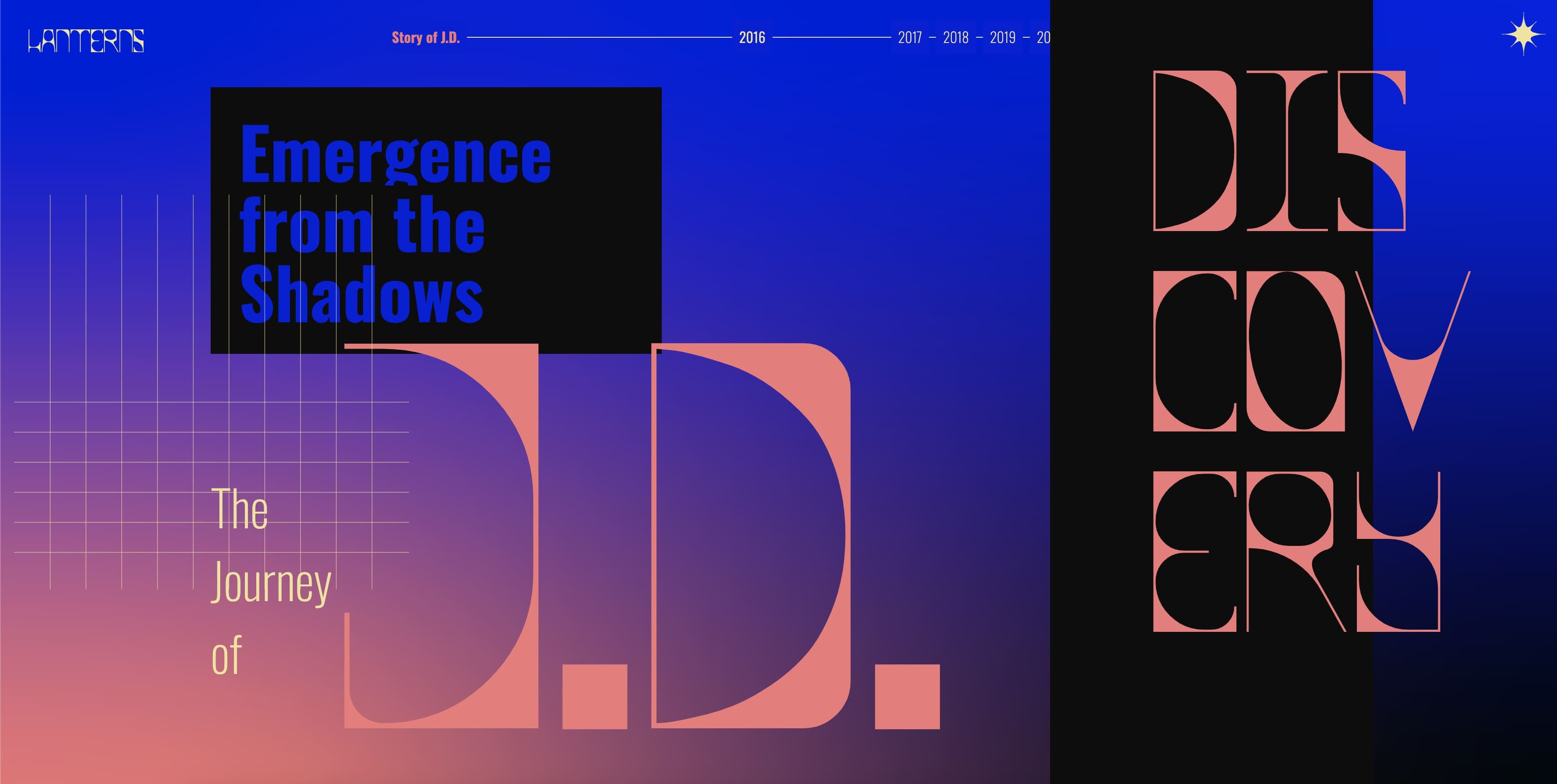
Typography and Accessibility: The custom-designed "Lanterns" font by Savvy Cobra is optimized for readability on dark backgrounds, mimicking the effect of sparkling light which is central to the thematic essence of the platform. This typography ensures that the site is not only visually appealing but also accessible to all users, reinforcing the inclusive nature of the project.
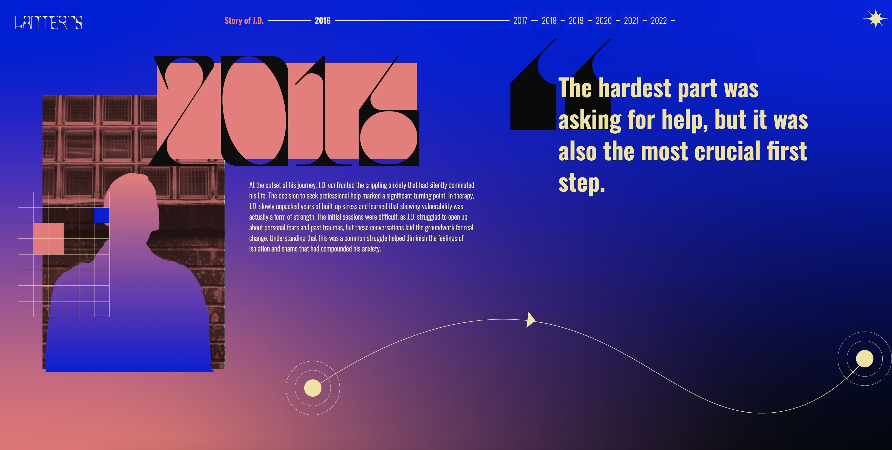
Animations and User Interaction: Interactive animations are strategically implemented throughout the Lanterns site to engage users actively. The animations include gentle flickering effects that mimic the soothing glow of a lantern, which enhances the user's emotional connection to the content and the overall experience.
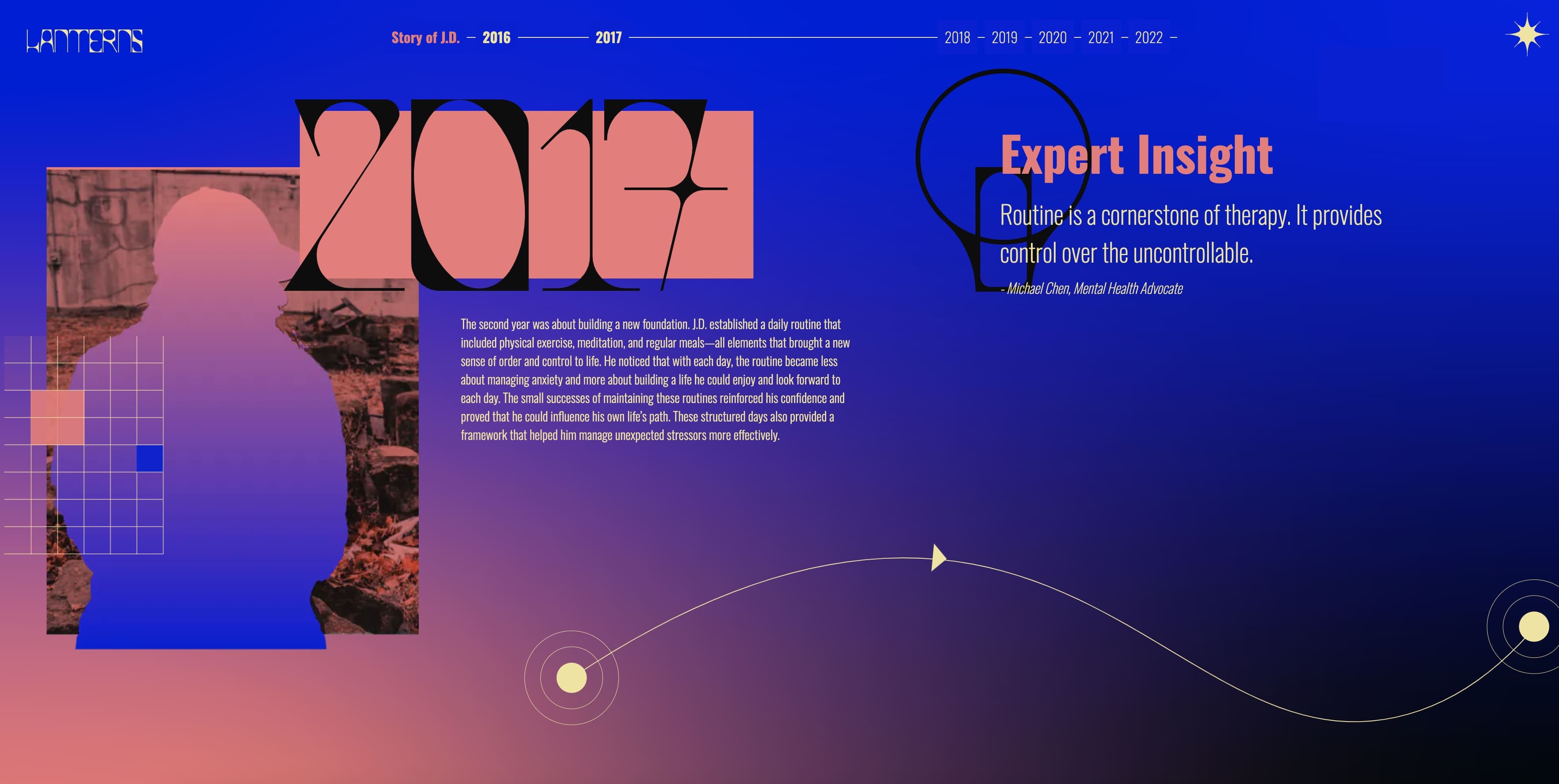
Narrative and Content Presentation: Each story on Lanterns is framed within a context of recovery and success, with the design elements complementing the narratives. The flashing grid squares, a key design feature, are used to visually represent the theme of identity fragmentation and recovery, adding depth to the stories shared.
Future Enhancements and Community Engagement: The ongoing development of Lanterns includes plans for enhanced navigation and search functionalities, making it easier for users to find stories that resonate with their specific circumstances. The platform's design will continue to evolve, focusing on community feedback and volunteer contributions to enrich the range and depth of content available.
