GraphicDesign
Tetley Packaging Redesign
Context
The design for Tetley's green tea packaging is a blend of minimalistic elegance and a subtle nod to the natural origins of tea. The slender lines depicting tea plant branches not only evoke the essence of green tea but do so with a refined simplicity. This approach creates a visually soothing and recognizable pattern, offering a serene yet sophisticated packaging design that stands out on the shelves, inviting consumers to a calming tea experience.
Solution
As a designer, I am elated to unveil my recent endeavors for Tetley, encompassing distinctive concepts for green tea packaging I had the honor to craft. My concept hinges on the elegance and uncluttered nature of minimalism, yet eloquently articulates the essence of green tea with a dash of sophistication. The primary visual facet of this design is a sequence of slender lines symbolizing tea plant branches, arranged in an organic pattern that is visually appealing and easily identifiable.
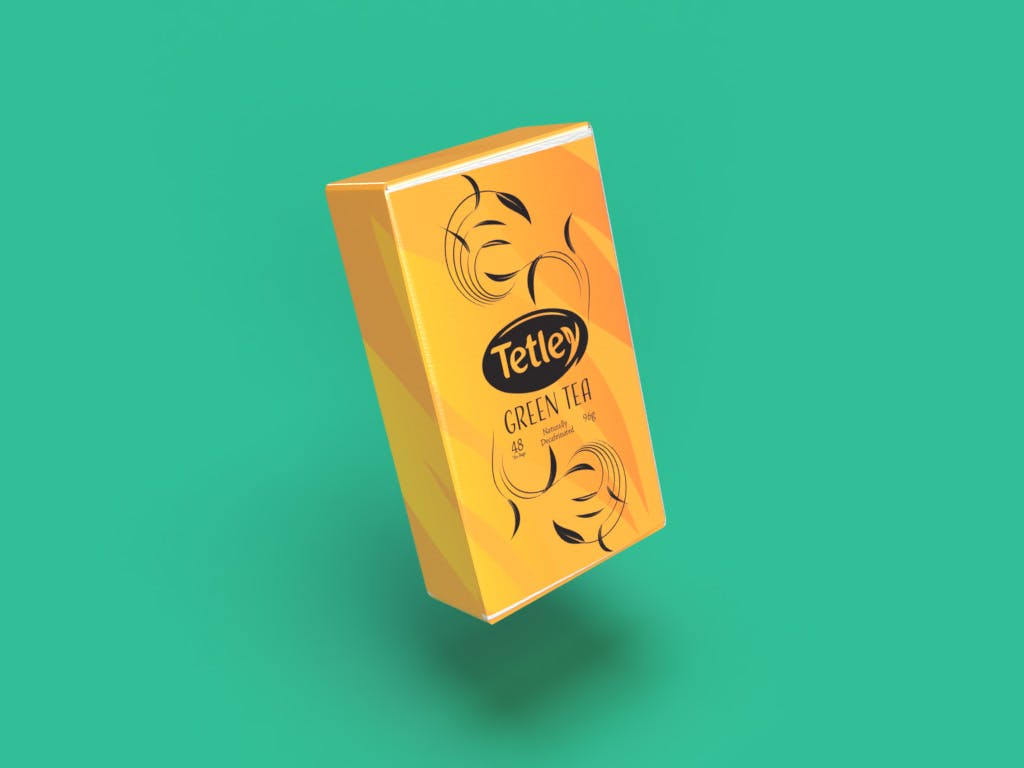
The design approach for Tetley's green tea packaging is a narrative of minimalistic elegance intertwined with the organic essence of green tea. The use of slender lines to symbolize tea plant branches is a subtle yet poignant visual cue, creating a connection to the natural and calming essence of green tea.
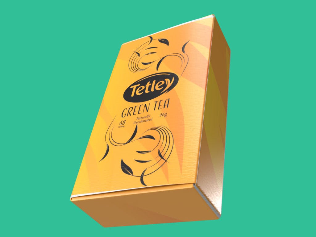
This minimalistic yet sophisticated design strives to not only catch the eye but also resonate with the calm and soothing aura associated with a cup of green tea, embodying a blend of aesthetic appeal and meaningful symbolism.