GraphicDesign
Kix Cereal Packaging Redesign
Context
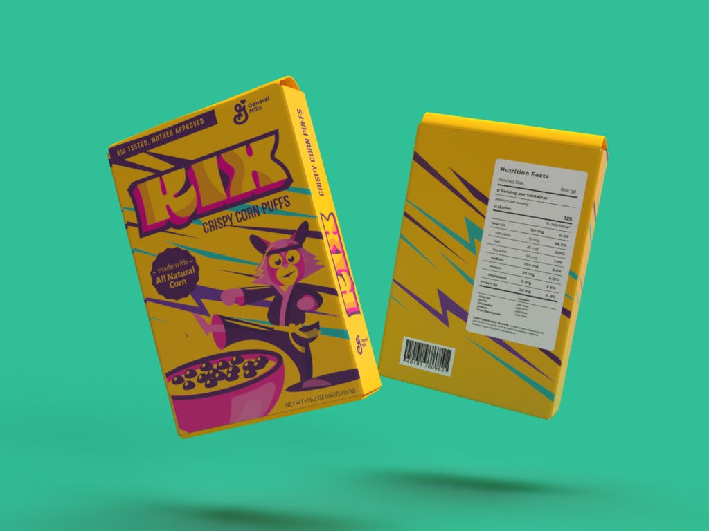
The Kix cereal box redesign is a burst of creativity aimed at making breakfast a delightful experience. The vivacious fox character not only adds a whimsical touch but also resonates with the energetic spirit of morning routines. The bold colors and playful patterns intertwine to create an inviting visual appeal that beckons shoppers. This design is more than just an eye-catcher; it's a morning invitation to a day filled with playful energy and wholesome goodness.
Solution
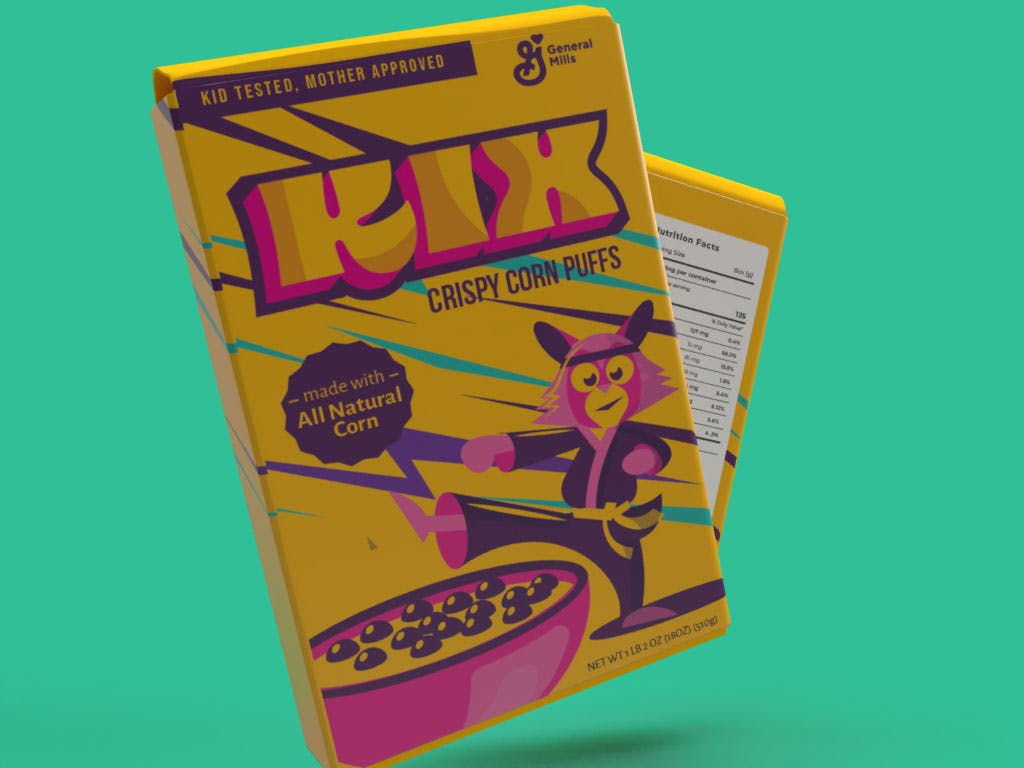
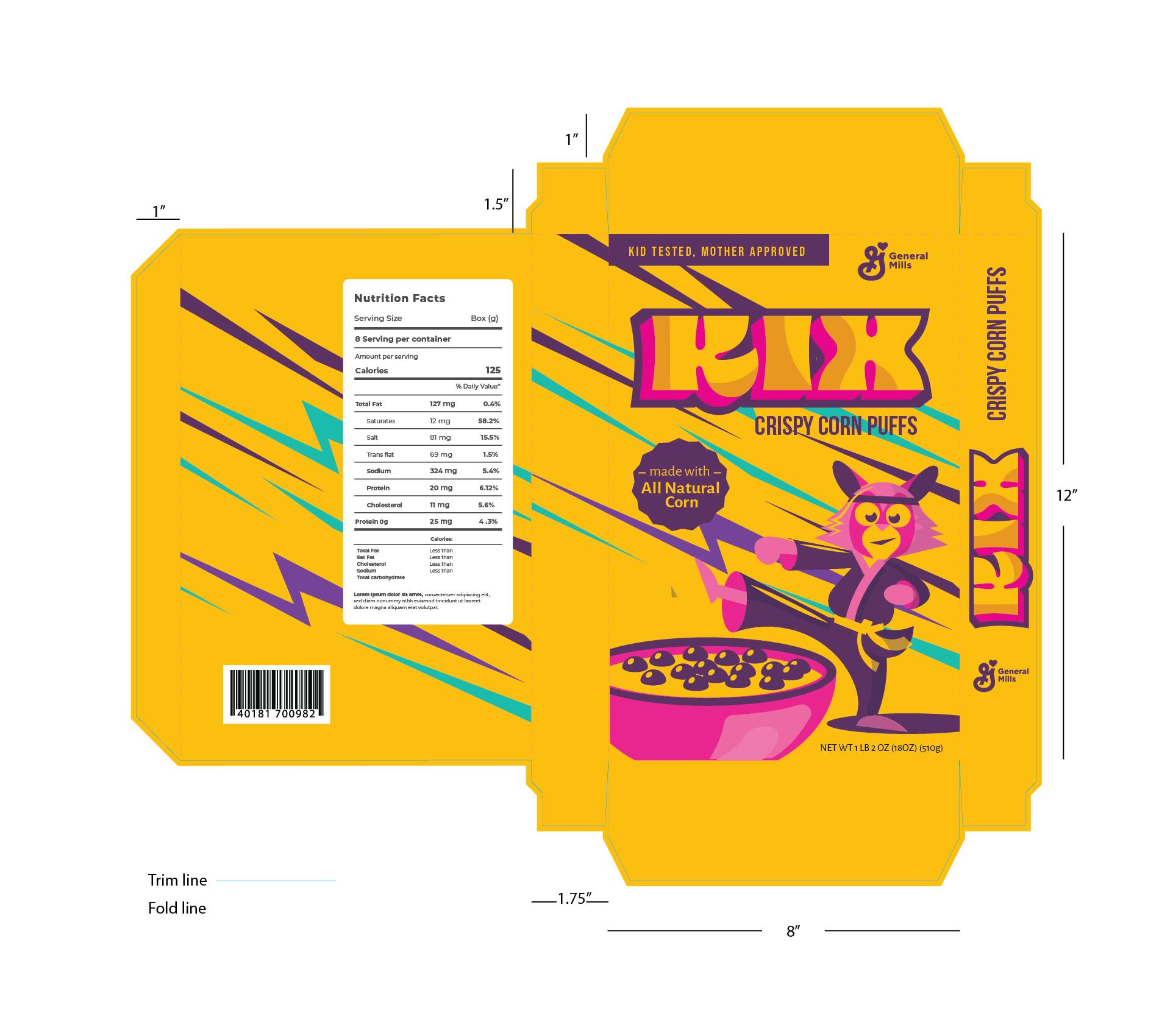
A revamp of the Kix cereal box adorned with a lively and playful illustrated fox character! In tackling the redesign, my aim was to craft a box that would instantly capture shoppers' attention as they navigated through the cereal aisle. The bold, eye-catching colors and patterns I opted for set the perfect stage for our clever fox, garbed in a traditional martial arts gi. The fox radiates a blend of confidence and playfulness, enticing kids and adults alike to kickstart their day with a scrumptious bowl of Kix.

The redesign journey for the Kix cereal box was a venture into blending playful imagery with bold aesthetics to create a visual magnet in the cereal aisle. The spirited fox character, donned in a traditional martial arts gi, serves as a whimsical mascot that embodies a sense of playful confidence, aligning with the energetic vibe of starting the day with Kix.

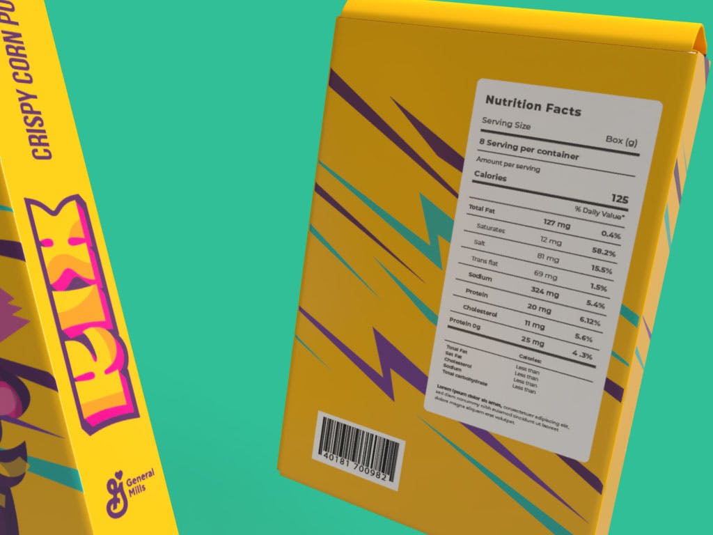
The choice of bold, arresting colors and patterns creates a lively backdrop that not only highlights the fox character but also resonates with the playful and energetic essence of morning routines. This design initiative aims at transforming the mundane task of cereal selection into an engaging, delightful experience, making the Kix cereal box a visual treat that promises a joyful start to the day.


